A lot of information,
easy to find
Narnia, a church primary school, needed to replace its outdated and confusing website. We designed a new information architecture, UX and visual design, and built the site so that the school can manage it on its own.
Parents come to a school website for documents, forms, dates and announcements. Here, clarity matters more than looks.
2023
launch of the new website
6
sections in the main menu, with 29 subpages
5
content types managed by the school
0
developer interventions for routine content edits
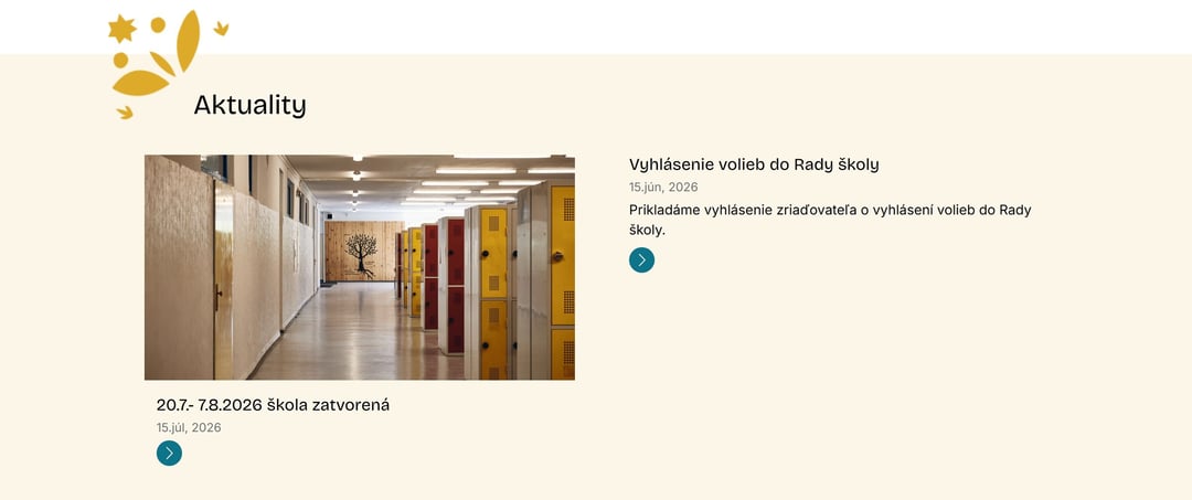
A school website is not a showcase
Parents come for practical things: when the meetings are, what needs filling in, where to find the school rules, how to enrol a child. Pupils look for the timetable and after-school clubs. And the school needs to keep changing all of it.
The old website could no longer cope, because finding anything specific was hard. The new one therefore had to make a large amount of information clearer and easier to keep up to date.
Say less. Help people find things.
The school first, then the website
We did not work only from the existing website. We sat down with the teaching staff to find out what the school needs to communicate and how parents and pupils actually look for it.
Needs analysis
We went through the content and the school's requirements with the teaching staff. The result was an information architecture based on how the site is actually used.
UX and design
A new structure and look in which content comes before effects.
Development and content migration
We developed the site and moved the existing content into it, including photos, documents and forms. We kept adjusting it based on the school's feedback.
Admin for the school's editors
Predefined fields and guidance in the admin, so the school makes everyday changes without needing a developer.
Information architecture needs the school.
Six sections in a parent's language
We organised the content by who is looking for it. The main menu has six sections with 29 subpages between them.
About us
School life
Prospective families
Parent community
Pupil support
FAQ
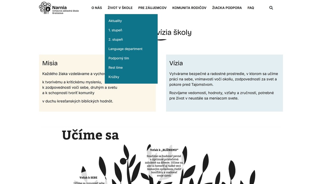
Visually, the site stays quiet: cream and pale-blue surfaces, large typography and illustrations created for the school by the illustrator daniole.com. Clarity was meant to be the first thing anyone notices on the site.
Parents don't want an org chart.
The school year in one calendar
Dates are the most sought-after content on a school website. The events calendar sorts them by month. Each event has a date, the day of the week and an explanation, and the whole year is also available as a downloadable PDF.
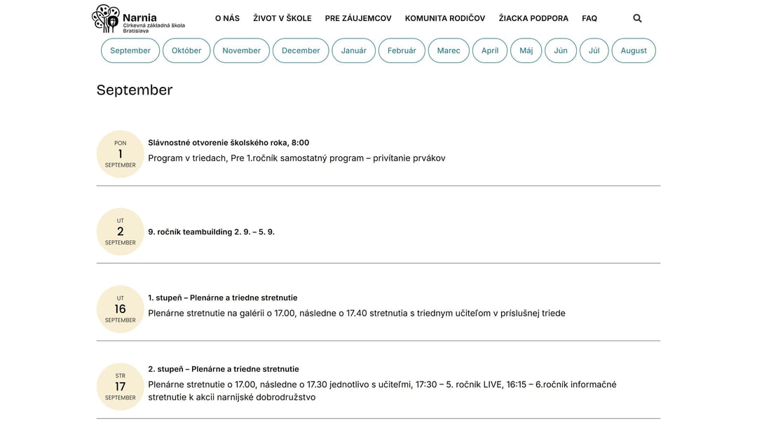
Events have their own content type, so the school adds a meeting once and it appears both in the calendar and in the overview on the homepage.
Five content types run by the school
So that running the site does not fall to a developer, each kind of content has its own type with predefined fields and guidance. The school does not have to write everything into one large text editor.
Pages
Content pages assembled from ready-made sections.
Staff
A profile with a photo, role and school email; the listing builds itself.
News
Dated announcements that also appear on the homepage.
Events
Dates with the day and an explanation, sorted by month.
Job vacancies
Open positions in the Careers section.
That is why the list of teachers and staff does not have to be put together by hand, and today it has more than 120 profiles, each with a photo, role and school email address. When someone joins, the school adds their profile and the listing updates itself.
The content type tells editors what to fill in.
Documents in one place
Parents will find the school rules here, including versions for children, as well as applications for absence from lessons, for studying abroad and for a fee refund.
There is no need to download a document to read it: parents see it right on the page and open a form with one click. When something changes, the school uploads the new version to one place and does not have to hunt down every page that links to the old file.
Less searching, simpler management
The new website represents the school better, but above all it solves the practical problem of the old one: information is organised the way people look for it, and the school can keep it up to date.
“We are very pleased with the new site and have had good feedback on it.”




A clear website does not happen by accident.
When a website grows and stops being clear, the first step is getting the content in order, and only then a new design. We can take a look at yours too.
No-obligation consultation.
We reply within 24 hours.